A Q-Q plot, or quantile-quantile plot, is a graphical tool used to assess if a dataset follows a specific theoretical distribution, most commonly the normal distribution. This guide will walk you through the process of creating a Q-Q plot in Microsoft Excel.
Understanding the Q-Q Plot
The fundamental principle behind a Q-Q plot is to compare the quantiles of your observed data against the quantiles of a theoretical distribution. If the data points closely align with a straight line, it suggests that the data likely comes from that theoretical distribution.
Step-by-Step Tutorial
Follow these steps to generate a Q-Q plot for your dataset in Excel:
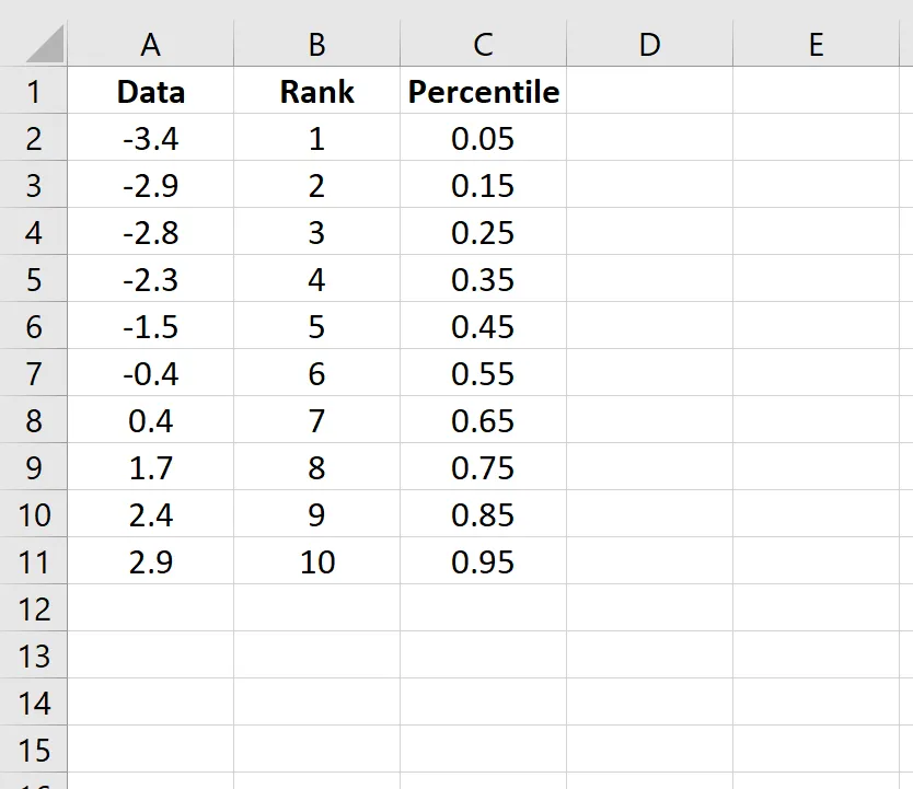
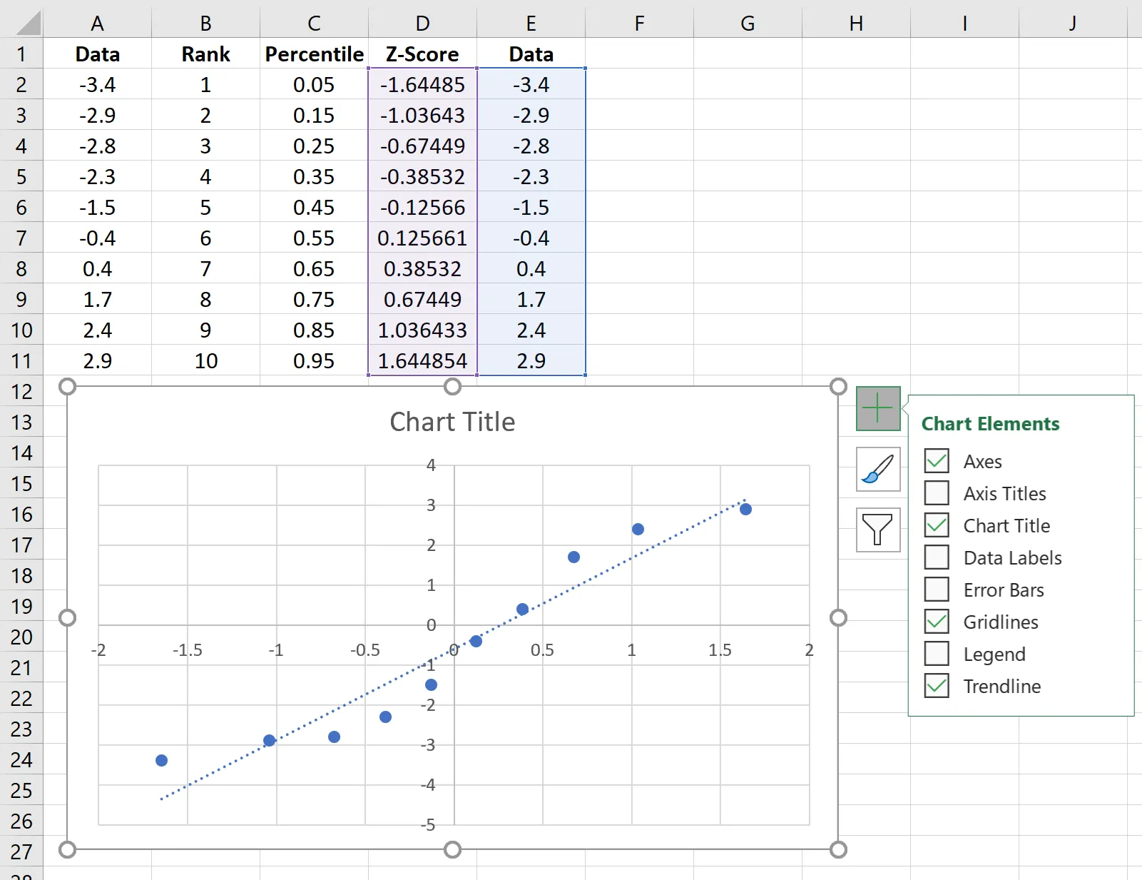
Step 1: Data Entry and Sorting
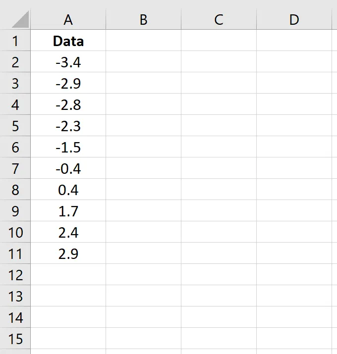
Begin by entering your dataset into a single column in Excel.
Ensure your data is sorted in ascending order. If it’s not, navigate to the Data tab on the Excel ribbon, locate the Sort & Filter group, and click the Sort A to Z icon.
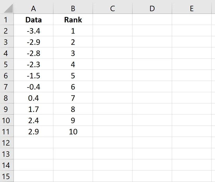
Step 2: Calculating Data Ranks
Next, you need to determine the rank of each data point. Use the following formula in the adjacent column for the first data value:
=RANK(A2, $A$2:$A$11, 1)
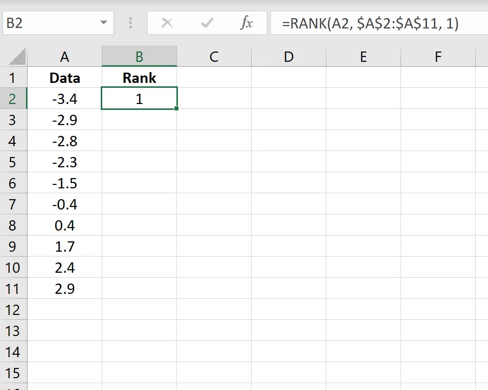
Copy this formula down to apply it to all data points in your column. This will assign a rank from 1 (smallest) to the total number of data points (largest) to each value.
Step 3: Calculating Percentiles
Now, calculate the percentile for each data value. In the next column, use this formula for the first data point:
=(B2-0.5)/COUNT($B$2:$B$11)
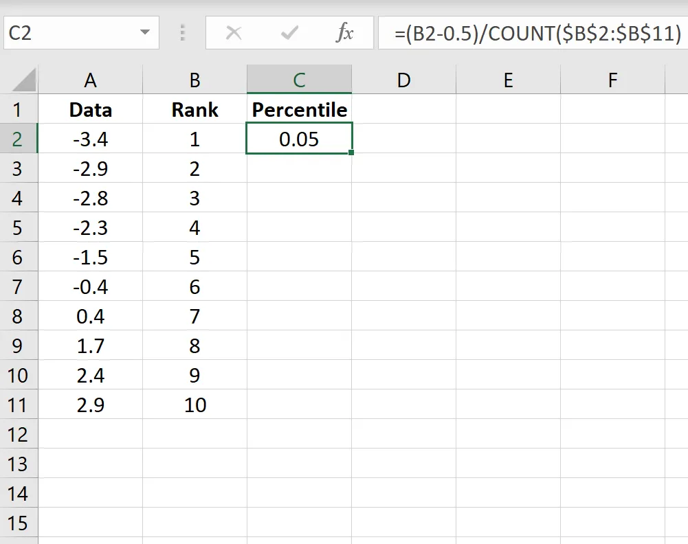
Again, copy this formula down to populate the rest of the column. This calculation adjusts the rank to represent a percentile position, crucial for the next step.
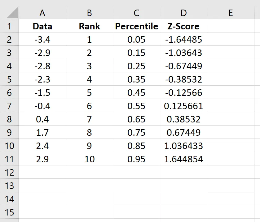
Step 4: Calculating Z-Scores
To compare your data to a normal distribution, you’ll calculate the z-score for each data point. Use the NORM.S.INV function, which returns the inverse of the standard normal cumulative distribution. For the first data value, the formula is:
=NORM.S.INV(C2)
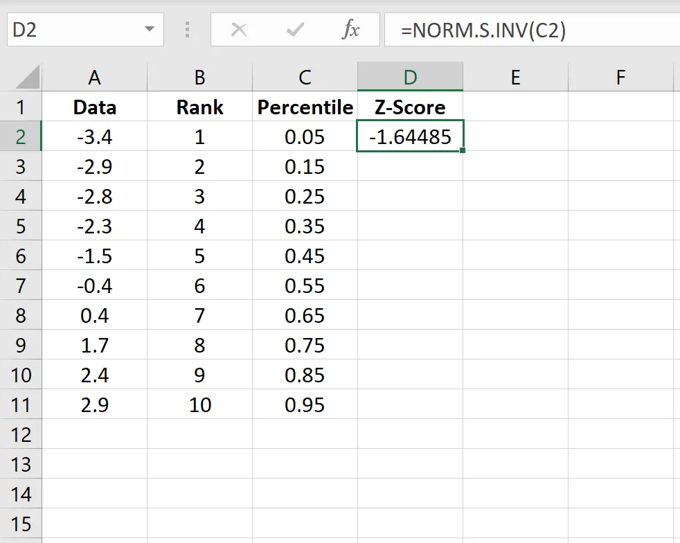 Z-score calculation in Excel
Apply this formula to all your data points by copying it down. The resulting z-scores represent how many standard deviations each data point is from the mean of a standard normal distribution.
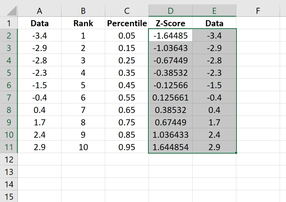
Step 5: Creating the Q-Q Plot
To create the plot, first copy your original data (from column A) into a new column (e.g., column E). Then, select both the z-score column (column D) and the copied original data column (column E).
 Q-Q plot example in Excel
Navigate to the Insert tab on the ribbon. In the Charts group, select Insert Scatter (X, Y) and choose the basic Scatter chart option. This will generate your Q-Q plot.
To enhance the visualization, click the plus sign (+) icon on the top right corner of the chart and check the box next to Trendline. This will add a reference line to your plot.
 Q-Q plot with straight line in Excel
Finally, you can add a chart title and axis labels for clarity and a more professional look.
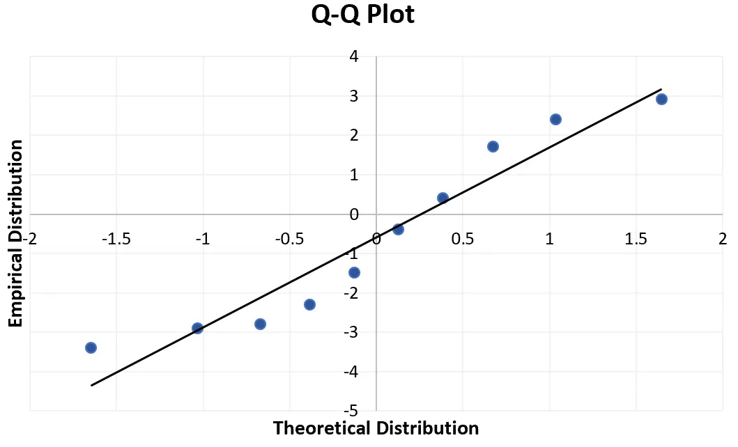
Q-Q plot in Excel
Interpreting Your Q-Q Plot
The interpretation of a Q-Q plot is straightforward: if the data points fall approximately along the 45-degree trendline, it indicates that your data is normally distributed. In the example plot above, you can observe that the data points deviate significantly from the straight line, particularly at the extremes, suggesting that this particular dataset may not be normally distributed.
While a Q-Q plot is not a formal statistical test, it serves as a valuable and easily accessible visual aid for initially assessing the normality of your data.