A Q-Q plot, or quantile-quantile plot, is a statistical visualization tool that helps you assess whether your data follows a normal distribution. By comparing your sample data against theoretical quantiles, this graphical method reveals how closely your dataset aligns with a normal curve. Whether you’re analyzing research data, financial information, or business metrics, understanding how to create a Q-Q plot in Excel or Google Sheets is an essential skill for data professionals. This guide will walk you through the complete process step-by-step, demonstrating how to build a Q-Q plot from raw data to finished visualization.
Understanding Q-Q Plots and Their Purpose
A Q-Q plot serves as a diagnostic tool in statistical analysis, allowing you to evaluate the distributional properties of your dataset visually. The plot compares quantiles from your sample data with quantiles from a theoretical normal distribution, plotting them as points on a scatter chart. When these points align closely with a diagonal trendline, it indicates your data approximates a normal distribution. Conversely, significant deviations from the trendline suggest your data departs from normality. This information proves invaluable for selecting appropriate statistical tests and understanding data characteristics before performing further analysis.
Creating a Q-Q Plot in Excel
Sort Your Data in Ascending Order
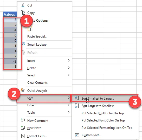
The foundation of an accurate Q-Q plot begins with organizing your data from smallest to largest value. This ranking process ensures proper percentile calculations in subsequent steps.
- Select and right-click on your data range
- Choose Sort from the context menu
- Click Sort Smallest to Largest
Calculate the Rank for Each Data Point
Once your data is sorted, calculate the rank for each value. This step assigns a sequential number to each observation, which forms the basis for percentile computation.
Add a “Rank” column and use the RANK function:
=RANK(B6,$B$6:$B$15,1)![]()
Note: Use absolute cell references (dollar signs) so you can copy and paste the formula down to all data points without adjusting the range.
Compute the Percentile for Each Value
The percentile calculation converts each rank into a decimal value between 0 and 1, representing the position of each observation within the distribution.
Add a “Percentile” column and enter the formula:
=(C6-0.5)/COUNT($C$6:$C$15)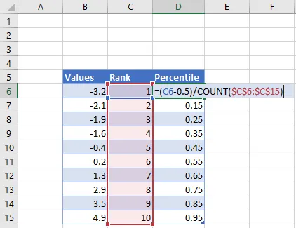
This formula subtracts 0.5 from each rank and divides by the total count of observations, producing the percentile for plotting against theoretical quantiles.
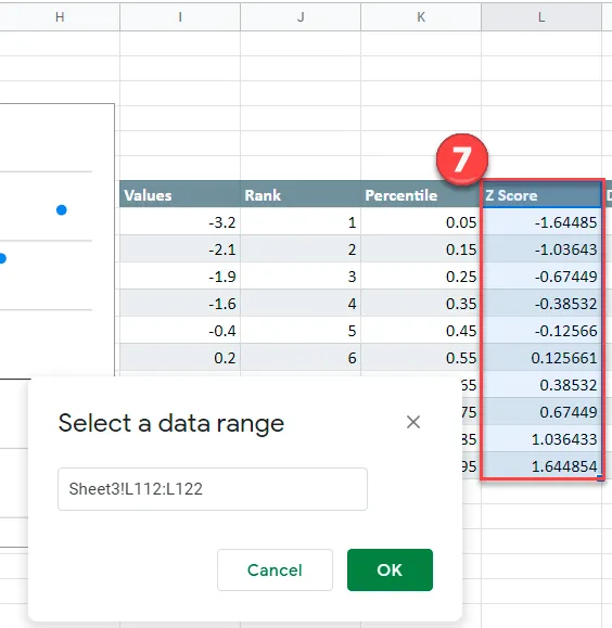
Calculate Z-Scores Using the Inverse Normal Function
Z-scores represent standardized values showing how many standard deviations each data point lies from the mean of a normal distribution. The NORM.S.INV function converts your percentiles into these standardized normal quantiles.
Add a “Z-Score” column and enter:
=NORM.S.INV(D6)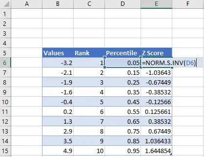 Calculate Z Score of Each Value for Q Q Plot Excel
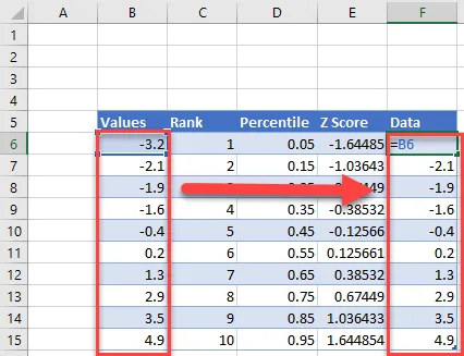
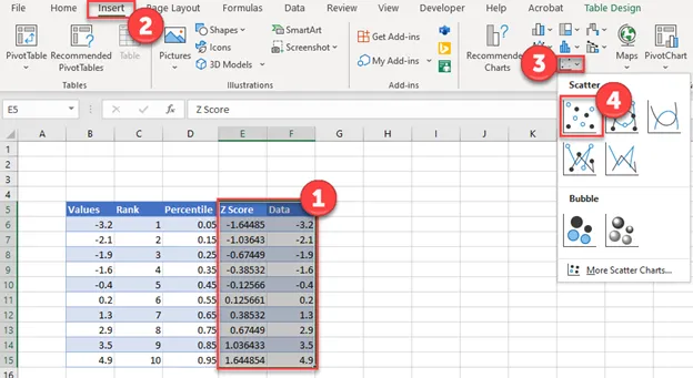
Prepare Data Columns for Plotting
Before creating your scatter chart, duplicate your original data column to align with your Z-score values.
Insert the Scatter Chart
Now create the visual representation by building a scatter plot with Z-scores on the X-axis and your data values on the Y-axis.
- Highlight both the Z-Score and Data columns
- Navigate to the Insert tab
- Select Scatter
- Choose Scatterplot
 Create Scatterplot Graph for Q Q Graph in Excel
Add a Trendline to Assess Normality
The trendline provides a visual reference for evaluating how closely your data follows a normal distribution pattern.
- Click the + icon in the top right corner of your chart
- Select Trendline
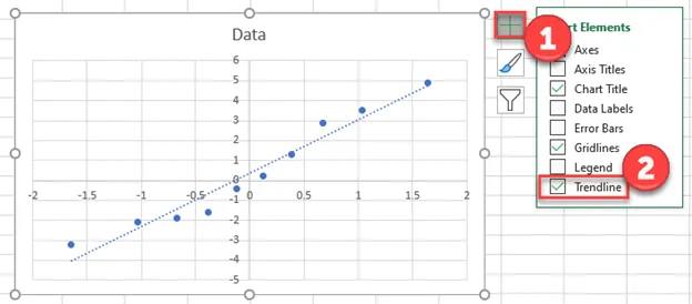
Your Excel Q-Q plot is now complete. Points that cluster tightly around the trendline indicate your data approximates a normal distribution, while scattered points suggest deviations from normality that may influence your statistical analysis choices.
Creating a Q-Q Plot in Google Sheets
Build Your Initial Scatter Chart
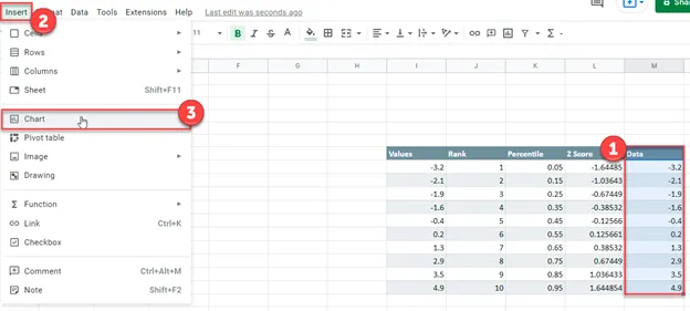
Google Sheets offers a streamlined approach to Q-Q plot creation using the same data preparation as Excel. Start by creating a basic scatter chart from your data.
- Highlight your Data column
- Click Insert
- Select Chart
 Create Scatterplot for Q Q Graph in Google Sheets
Configure the Chart as a Scatter Plot
After inserting the chart, customize it to display as a proper scatter chart and set the Z-scores as your X-axis values.
- Change the Chart type to Scatter Chart
- Navigate to X-Axis
- Click the Select a data range checkbox
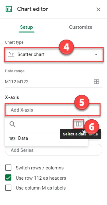
- Select your Z-Score data range and click OK
 Add X Axis to Q Q Graph in Google Sheets
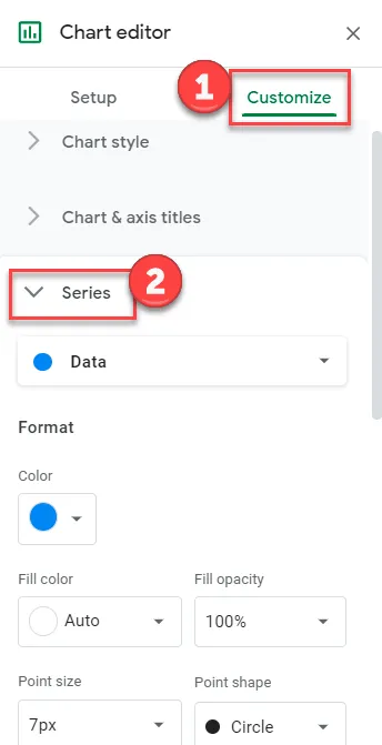
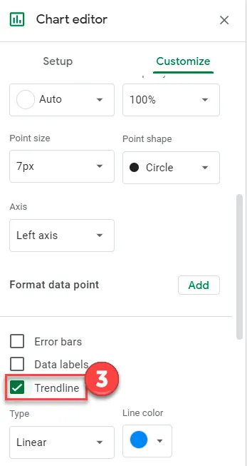
Add a Trendline for Distribution Assessment
The trendline in Google Sheets functions identically to Excel, providing visual confirmation of your data’s normality characteristics.
- Click Customize in the chart editor
- Select Series
 Add Trendline to Q Q Graph in Google Sheets
- Check the Trendline checkbox
 Check Trendline for Q Q Graph in Google Sheets
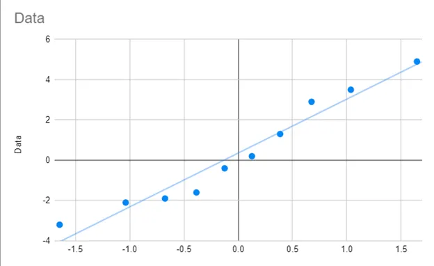
Review Your Completed Q-Q Plot
Your finished Google Sheets Q-Q plot provides the same diagnostic capabilities as the Excel version. The visualization clearly shows whether your data points align with the expected normal distribution pattern.
 Final Q Q Graph for Google Sheets
Interpreting Your Q-Q Plot Results
Understanding what your Q-Q plot reveals is crucial for proper statistical decision-making. When data points cluster closely around the trendline, your dataset exhibits characteristics consistent with a normal distribution, making parametric statistical tests appropriate. However, when points deviate substantially from the line—particularly at the extremes—your data demonstrates non-normal characteristics requiring alternative analytical approaches or data transformation techniques.
Conclusion
Creating a Q-Q plot in Excel or Google Sheets empowers you to make informed decisions about your data analysis methodology. By following these systematic steps, you can transform raw numerical data into a powerful visual diagnostic tool that reveals distributional properties at a glance. Whether you choose Excel’s comprehensive charting features or Google Sheets’ collaborative cloud-based environment, the process remains straightforward and accessible to data analysts of all experience levels. Begin by sorting your data and calculating ranks, percentiles, and Z-scores—each step building toward a complete understanding of your dataset’s normality characteristics. Take action today by implementing these techniques in your next data analysis project, and unlock deeper insights into your statistical information.