Adding new data to an existing chart in Microsoft Excel is a common task that can significantly enhance the insights derived from your data visualizations. Whether you’re tracking quarterly profits, sales figures, or project timelines, the ability to update your charts with fresh information is crucial for maintaining their relevance and accuracy. This guide will walk you through the straightforward process of incorporating a new data series into your Excel charts, ensuring your visualizations always reflect the latest data.
Understanding Data Series in Charts
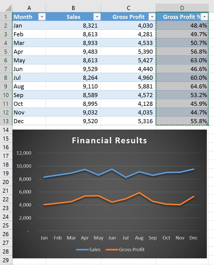
A data series in Excel charts represents a set of related data points plotted on the chart, typically corresponding to a row or column in your worksheet. For instance, if you have a chart displaying sales figures for multiple years, each year’s sales data would constitute a separate data series. Charts in Excel are intrinsically linked to an Excel-based worksheet, even if the chart was created in another Office application like Word. This connection allows for dynamic updates.
Adding a Data Series to a Chart on the Same Worksheet
When your chart and its source data reside on the same worksheet, updating it with a new data series is remarkably simple and can often be done through direct manipulation.
- Enter New Data: Begin by entering your new data series into the cells directly adjacent to, or below, your existing source data on the worksheet. For example, if your chart displays sales data for 2023 and 2024, and you’ve just added the 2025 sales figures, input this new data in the appropriate cells.
- Select the Chart: Click anywhere within your chart. This action will visually highlight the current source data on the worksheet, displaying sizing handles around it. You’ll notice that the newly entered data series is not yet included in this selection.
- Adjust the Data Range: Click and drag the sizing handles that appear around the selected source data. Extend these handles to encompass the new data series you just entered.
- Automatic Update: Once you release the mouse button, Excel will automatically update the chart. The new data series will now be visible and plotted alongside your existing data.
This method leverages Excel’s ability to dynamically resize the data range based on the selected area, making it a quick and intuitive way to update charts located on the same sheet as their data. For those looking to refine their chart’s appearance further, exploring how to add target line to excel graph can provide additional context for data comparison.
Adding a Data Series to a Chart on a Separate Chart Sheet
If your chart is situated on a dedicated chart sheet (a separate sheet that contains only the chart), the drag-and-drop method might not be as straightforward. In such cases, using the “Select Data Source” dialog box is the recommended approach. This method offers more precise control over the data range linked to your chart.
- Enter New Data: As with the previous method, first enter your new data series into the cells on your worksheet, either next to or below your existing source data.
- Access Select Data Source: Navigate to the worksheet containing your chart. Right-click on the chart and select “Select Data” from the context menu. Alternatively, if you are using a newer version of Excel, you can find this option under the “Chart Design” tab by clicking “Select Data.”
- Define the Data Range: The “Select Data Source” dialog box will appear. With this dialog box still open, return to your worksheet and click and drag to select the entire range of data you wish to include in the chart. Crucially, ensure this selection now encompasses your newly added data series.
- Confirm Changes: As you select the data, the new series will appear listed under “Legend Entries (Series)” within the dialog box. Once you have selected all the desired data, click “OK” to close the dialog box and apply the changes to your chart sheet.
This process ensures that your chart on a separate sheet is accurately updated to reflect the latest information from your worksheet. Understanding different charting techniques can be beneficial, and resources like calibration curve on excel demonstrate the versatility of Excel for data analysis.
Conclusion and Further Tips
Effectively updating your Excel charts with new data series is a fundamental skill for anyone working with data analysis and visualization. By mastering these methods, you can ensure your charts remain accurate, informative, and relevant over time. Remember that Excel provides a robust suite of tools for data manipulation and presentation, and exploring features like Excel for dummies PDF can offer foundational knowledge for broader Excel proficiency. Always ensure your data is clean and well-organized before adding it to a chart for the best results. If you frequently work with specific data manipulations, learning techniques like removing last digit in excel can streamline your workflow.