
To make a bar graph in Office 365 Word, open a document, select Insert > Chart, choose Bar from the chart categories, and select a style. Replace the sample values in the embedded spreadsheet editor with your own data, then use the Chart Design and Format tabs to customize the chart.
Creating a bar graph in Office 365 Word can be done directly inside a Word document without requiring Excel as a separate workflow. Select the Insert tab, choose Chart, select a Bar chart type, and edit the built-in spreadsheet data editor to add your values. This guide explains how to insert, edit, and customize a bar graph directly in Word.
To create a bar graph in Microsoft Word, open your document, select Insert > Chart, choose Bar from the chart categories, enter your values in the embedded spreadsheet editor, and use the Chart Design and Format tabs to adjust the appearance. Word creates the chart inside the document while using a small spreadsheet editor for the chart data.
Create a bar graph in Word with built-in Chart tools
Microsoft Word includes built-in chart creation tools that allow users to add data visualizations directly to a document. When you insert a chart, Word opens a small spreadsheet editor based on Excel functionality so you can replace sample values with your own categories and numbers.
A bar chart displays data using horizontal bars, making it useful when readers need to compare categories, rankings, or items with longer names. The process does not require a separate Excel workflow because Word can create the chart object and manage its data from within the document.
The main path to remember is: Insert tab > Chart button > Bar chart selection. After insertion, Word adds chart controls that appear when the chart is selected.
The embedded spreadsheet is only for managing the chart’s data. You do not need to build a full Excel workbook unless you want to connect the chart to existing Excel information.
Insert and build the bar chart in a Word document
The first chart creation workflow has three parts: opening the chart menu, selecting the correct chart type, and replacing the sample data. Keeping these steps separate helps avoid a common mistake where users format a chart before the correct data has been added.
Insert the chart and select the Bar option
Start with the Word document where the graph should appear. Place the cursor at the location where you want the chart, then open the ribbon menu.
- Select the Insert tab at the top of Word.
- Choose the Chart button in the Illustrations section.
- In the Chart dialog box, select Bar from the list of chart categories.
- Choose a bar chart style and select OK to insert it.
Word immediately places a sample chart into the document and opens the data editor. The sample categories and values are placeholders, so the chart is not finished until you replace them with your own information.
A simple example is a document comparing sales values for three product categories. The workflow is:
- Open the Word document and choose Insert > Chart from the ribbon.
- Select Bar as the chart category and insert the chart.
- Replace the sample spreadsheet values with the product categories and sales numbers.
- Close the data editor and review the updated graph in Word.
The result is an embedded bar chart with custom categories and values. The available chart options can differ between desktop Word and Word Online versions.
Enter data in the embedded spreadsheet editor
After inserting the chart, Word opens a mini spreadsheet for chart data. This editor contains rows and columns similar to an Excel worksheet, but it is focused on supplying values for the chart.
Replace the sample information by editing the category names and numerical values. For example, the first column may contain product names, while the next column contains sales totals. Each column of values becomes a data series that Word uses to draw the bars.
When editing data, check three areas before closing the spreadsheet editor:

- Category names match the labels you want readers to see.
- Values are entered in the correct rows and columns.
- Extra sample rows or columns are removed if they are not part of your data.
A frequent beginner error is leaving unused sample data in the worksheet. The sign of this problem is a chart that shows unexpected categories or additional bars that do not match the document’s purpose.
Edit chart data and customize the graph after insertion
Once the bar chart exists in the Word document, most changes happen through the chart controls that appear when you select the graph. The goal is to make the information easier to read rather than applying every available design option.
In practical Word document work, the easy-to-miss step is checking the data before styling. A well-designed chart with incorrect values still communicates the wrong message.
To edit information after closing the spreadsheet editor:
- Select the chart in the Word document.
- Open the Chart Design tab.
- Select Edit Data to reopen the spreadsheet editor.
- Update categories, values, or data series.
- Close the editor and review the refreshed chart.
Change titles, labels, colors, and sizing
The most useful formatting changes for beginners usually affect readability. Start with elements that help readers understand the chart quickly.
- Change the chart title so it explains what the data represents.
- Adjust axis labels so categories and values are clear.
- Change chart colors to distinguish different data series when needed.
- Resize the chart area so labels are not crowded or cut off.
- Review legend settings and remove the legend if it does not help explain multiple data series.
A simple formatting checklist can prevent over-editing:
- Update the chart title so readers understand the information shown.
- Remove chart elements that do not support the main message.
- Resize the chart area so labels and values remain readable.
- Apply advanced style changes only after the basic layout is clear.
Changing colors can help distinguish different data series, but unnecessary visual effects can make comparisons harder. A clean chart usually needs only a clear title, readable labels, and an appropriate size.
Choose the right chart type and format for your data
Choosing the correct chart type affects how quickly readers understand comparisons. Word offers several chart categories, and the best option depends on the structure of the data rather than personal preference.
Bar charts versus column charts for comparisons
The main difference between a bar chart and a column chart is orientation. Bar charts use horizontal bars, while column charts use vertical columns.
Chart comparison
| Chart type | Best for | Data layout | Main advantage |
|---|---|---|---|
| Bar chart | Long category names, rankings, or many categories | Categories listed vertically with values extending horizontally | Makes category labels easier to read and compare |
| Column chart | Changes across fewer categories or time periods | Categories on the horizontal axis with vertical values | Highlights differences and trends across groups |
| Stacked chart | Comparing totals and parts within categories | Multiple data series combined in each bar or column | Shows how individual parts contribute to a whole |
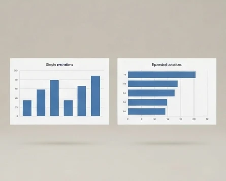
A practical decision rule is simple: choose a bar chart when category names are long or when readers need to rank many items. Choose a column chart when the number of categories is smaller and the goal is to emphasize changes across groups or periods.
To verify the chart type after creation, select the chart and open the Chart Design tab. The chart category and available design options should match the intended format. If the result shows vertical columns instead of horizontal bars, the wrong chart type was selected.
Formatting choices that improve chart readability
A readable chart guides attention toward the comparison instead of the design itself. Begin with the information readers need first, then adjust appearance.
Useful formatting decisions include:
- Keep category labels visible without overlapping.
- Use data labels when readers need exact values without estimating bar lengths.
- Limit unnecessary chart elements that create visual noise.
- Keep the chart size large enough for labels to remain readable in the Word document.
A common mistake is adding too many effects, colors, or decorative elements before checking whether the chart communicates clearly. If a reader cannot identify the categories and values quickly, additional styling will not solve the underlying issue.
Fix common Office 365 Word chart creation problems
Most chart problems come from one of three areas: the Word version being used, incorrect data editing, or selecting the wrong chart settings. Checking the cause first is faster than changing random options.
Missing Chart button in the Insert tab
If the Chart button is missing in Office 365 Word, first confirm which version of Word you are using. Desktop Word and Word Online do not always provide identical menus and feature availability.
A troubleshooting sequence can narrow down the cause:
- Check whether the document is open in desktop Word or Word Online.
- Confirm that the Insert tab is available in the current Word interface.
- Verify that the Microsoft 365 account or Word edition supports chart insertion.
- Check for missing chart settings only after confirming the version and access conditions.
A visible sign of a version difference is that the ribbon layout or available buttons do not match instructions written for desktop Word. In that case, switching to the desktop application may provide the full chart creation workflow.
Resolving data and display errors in charts
Incorrect charts often result from incorrect data ranges rather than a problem with Word itself. If a chart appears empty, shows unexpected categories, or displays the wrong number of bars, inspect the spreadsheet editor first.
Common checks include:
- Confirm that the selected data range includes the intended categories and values.
- Remove empty rows or columns that Word may interpret as part of the chart data.
- Check that each data series contains the correct values.
- Reopen Edit Data from the Chart Design tab if the displayed chart does not match the worksheet.
The diagnostic signal is usually visible in the chart itself: missing bars suggest missing values, while extra bars often indicate leftover sample data or incorrect ranges.
Create charts across Word desktop and Word Online
The chart workflow depends partly on where Word is running. Understanding the difference prevents confusion when a menu shown in a desktop tutorial does not appear in a browser window.
Differences between desktop Word and Word Online
Desktop Word generally provides the complete ribbon-based chart workflow, including chart insertion, chart editing, and detailed formatting controls. Word Online can edit many document elements but may have differences in available chart creation features depending on the current Microsoft 365 environment.
If you cannot find the expected chart controls in Word Online, check whether the task requires desktop Word. A practical verification method is to compare the available options after selecting a chart: desktop Word should display chart-specific tabs such as Chart Design and Format.
The observable difference is that desktop Word supports the full Insert > Chart > Bar workflow described above, while Word Online may not show the same chart insertion controls or formatting tabs. Checking the available ribbon options after selecting a chart is the quickest way to verify which environment you are using.
Using Excel data with Word charts
Word charts can use data from the embedded spreadsheet editor, but users who already have Excel data may prefer maintaining the source values in Excel and bringing that information into Word.
When working with Excel and Word together, consider these points:
- Use the same category names and value structure to prevent mismatched labels.
- Check whether the chart is linked to external Excel data or using embedded values.
- Reopen the chart data editor when values need updating.
A useful rule is to keep simple document charts inside Word and use Excel as the data source when the information changes frequently or requires more advanced analysis.
Improve your Word bar graph before sharing it
Before sending or publishing a document, review the chart as a reader would see it. A correct chart should have accurate values, understandable labels, and a layout that fits the surrounding content.
A final verification checklist helps catch common mistakes:
- Confirm the Chart Design tab appears after selecting the inserted chart.
- Select Edit Data and verify that the spreadsheet editor opens.
- Check that the chart orientation matches the chosen Bar or Column type.
- Review that displayed categories and values match the entered data.
With a few minutes of review, many common chart problems can be found before the document reaches an audience. The most important checks are accuracy, readability, and whether the selected chart type matches the comparison you want to show.
Open a Word document today, insert a sample bar chart using Insert > Chart > Bar, and replace the sample values with three categories from your own data so you can confirm the full workflow and see how the final chart appears in your document.
FAQ
Does Word require Excel to create a bar graph?
No, Word does not require a separate Excel workflow to create a bar graph. You can insert a chart directly in Word and use the built-in spreadsheet editor to enter categories and values. Excel functionality supports the chart data editor, but you do not need to create a separate Excel workbook for a basic Word chart.
Can I change a Word chart from bar to column later?
Yes, you can change the chart type after creating it. Select the chart in the Word document and use the chart controls, including the Chart Design tab, to choose a different chart format. A bar chart uses horizontal bars, while a column chart uses vertical columns for comparisons.
Can I remove the data worksheet after creating a chart?
The spreadsheet editor is used to manage the chart’s data, but the chart remains connected to its values after you close the editor. You can reopen the data editor later through Chart Design and Edit Data if you need to update categories, values, or data series.
Can I move a Word chart to another document?
Yes, an embedded Word chart can be moved to another document by using standard document editing actions. When moving the chart, review that the displayed categories and values remain correct and that the chart formatting still fits the new document layout.