
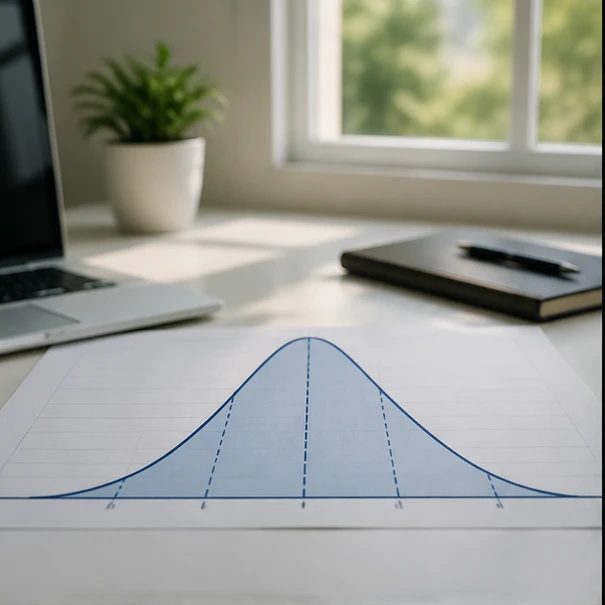
A distribution curve in Excel is a chart that shows how values in a dataset are spread across a range. It uses calculated data points or probability density values to display patterns such as central tendency, variance, frequency, and the shape of a normal distribution.
When analyzing numerical data in a spreadsheet, raw values often fail to reveal the underlying patterns, spread, and probability of occurrence. Readers frequently have Excel datasets they want to evaluate but cannot determine how to turn raw numbers into a distribution curve that correctly displays frequency, probability, or data behavior. After finishing this article, you will be able to identify what a distribution curve represents, create a suitable Excel visualization, and choose the right charting approach for analyzing your data.
A distribution curve in Excel is a graphical representation of how values in a dataset are spread across a range, plotting data points or calculated probability densities to show central tendencies, variance, and frequency patterns. For broader guidance on this topic, see creating normal distribution curve in Excel.
Distribution curve Excel charts and what they show
Understanding how values relate to probabilities is fundamental when moving from raw spreadsheet data to statistical analysis. A distribution curve illustrates the frequency and probability of different outcomes within a dataset, helping analysts see whether values cluster tightly around a central point or spread out widely toward extremes.
The shape of the curve is governed heavily by two core statistical parameters: the mean, which establishes the center of the distribution, and the standard deviation, which determines the spread or dispersion of the data. When data points follow a symmetrical, bell-shaped pattern, the resulting visualization highlights the probability density function of a normal distribution.
Recognizing these patterns helps diagnose whether measurements are balanced, skewed to one side, or characterized by heavy tails. While raw numbers only list individual observations, a distribution curve translates those measurements into a visual profile of frequency distribution.
Building the worksheet data for a distribution curve
Generating normal distribution values with formulas
To plot a smooth distribution curve in Excel, you must generate a series of calculated y-axis probability density values corresponding to specific x-axis intervals. Excel handles this calculation using the NORM.DIST function, which computes the probability density function for a given value, mean, and standard deviation.

For a standard bell curve, the function syntax is structured as =NORM.DIST(x, mean, standard_dev, FALSE), where setting the final argument to FALSE returns the probability density rather than the cumulative distribution. This output provides the vertical height required for each point along the curve.
Creating value ranges for curve plotting
Before drawing a curve, the worksheet must be organized with clearly defined columns that separate source measurements from calculated plotting points.
Setting up these components correctly ensures that the chart engine receives clean, mathematically sound coordinate pairs.
Worked Example: Normal curve Excel plotting workflow
- Calculate the dataset mean with
AVERAGEand the standard deviation withSTDEV.S. - Create a sequence of x-values covering the expected data range around the mean.
- Use
NORM.DISTwithFALSEas the cumulative argument to calculate probability density values for each x-value. - Insert the x-value and density columns into an XY Scatter chart and select smooth lines to display the curve.
Creating a distribution graph in Excel from worksheet values
Plotting the generated values requires choosing the correct chart type to prevent Excel from treating statistical coordinates like categorical labels. Readers who need more chart-focused guidance can also review Excel chart normal distribution for related visualization concepts.
To build an accurate distribution graph, select your paired x-values and calculated probability density column, then insert an XY Scatter chart type. Once the scatter plot is generated, modify the chart formatting by selecting Smooth Lines in the series formatting options to transform disconnected coordinate markers into a continuous bell-shaped curve.
Choosing between Excel histograms and distribution curves
When analyzing data distributions, choosing the right visualization depends entirely on whether your objective is to examine observed measurement frequencies or evaluate theoretical probability models.
A histogram is best for showing observed frequencies, while a distribution curve is useful for displaying calculated probability patterns and theoretical models.
Checking whether an Excel bell curve is accurate
Visual appeal in a chart does not guarantee mathematical accuracy. Validating your Excel distribution model requires structured checks against the source dataset.
Compare the curve center with the calculated dataset mean, check whether the width reflects standard deviation, verify the x-axis range, and confirm that the chart uses the correct x-value and probability density columns.
Practical uses of distribution curves in Excel analysis
Visualizing probability distributions in Excel supports decision-making across multiple operational domains. In quality control and manufacturing, distribution curves help track whether product dimensions remain within acceptable upper and lower specification limits based on standard deviation thresholds.
FAQ
Can Excel create a distribution curve without a histogram?
Yes. Excel can create a distribution curve directly from calculated x-values and probability density values.
Which Excel chart type is best for a bell curve?
An XY Scatter chart with Smooth Lines is the best choice for a bell curve because it plots paired x and y values accurately.